The creation process
My Weekly Journal
Week 1: cameras and coding AKA little fixes
I started out the school year working on this a little, so technically this isn't week 1, but I didn't realize I'd be having to catelog my game's development, so we'll just ignore it. I previously only got the physics and animations working along with one level. The first thing I focused on as the week began was the screen boundaries. I noticed that if you walked toward the edge of the screen you would walk off it and fall to your death. I needed a way to prohibit the player character from walking off the edge of the screen. To do that I had to tell the screen to stop the player character if he reaches the top, left or right of the screen it should stop him. I made sure it allowed him to fall off the bottom of the screen because that way I can incorporate bottomless pits as a gameplay mechanic. After all of that I was able to translate that into the blocks Stencyl uses.

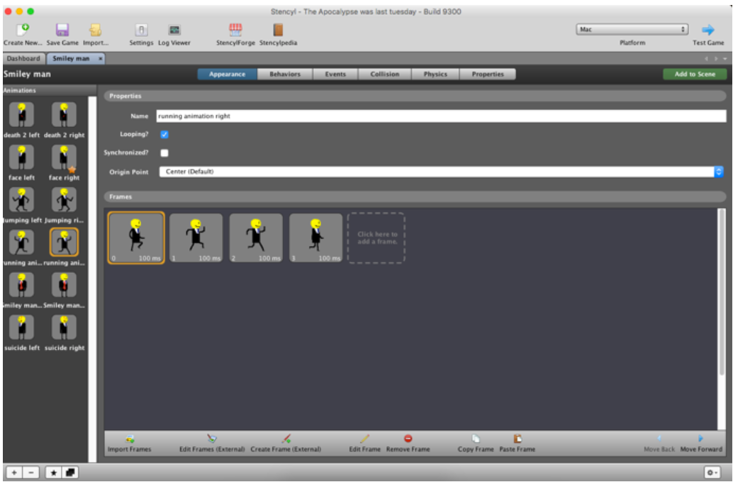
I realized as I was staring at my running animation there was a problem. He would be running like normal, but at the end of the animation cycle, he would somehow teleport a few millimeters backward. I did a lot of searching for what the problem could be in the code and the game rules until I found out that each frame of the animation was moving slightly forward until it would reset and go back to its starting position. I had to manually move each frame back to where it should be by going into Stencyl's image editor, Pencyl and drag everything back to where it should be. This is what it looked like at the end:
Week 2: Everything falls apart
AAAAAAAAAAAAAAAAAAAAAAAAAAAAAHHHHH!!!!!! I think that sums up my thought process for this week quite nicely all because of that (insert pained/bitter/angry sounding gibberish here) pop-up!

Ok, I'm sorry for that little freak out, I'll explain what happened. You see Stencyl has a problem since the engine is being powered off Java and for some reason if you use more than 2 gigabytes of Java's memory with the building of your game it will refuse to work. Because of this limit, my game stopped functioning and started randomly breaking things, such as making my background invisible or crashing my game. I spent a week trying to fix this such as asking the Stencyl forums and deleting and reinstalling Stencyl, but none of it fixed the issue. At this point, there was a lot of panicking and hyperventilating followed by thoughts of giving up completely.
The one bit of advice the website gave me was to edit the files of Stencyl, but I couldn't figure out how. Only then did I realize who I had forgotten to ask, the great, the powerful, the ever knowledgeable, dad. After an hour of work, he was finally able to figure out how to edit the app and together we changed the 2-gigabyte limit to a 500-gigabyte limit. And suddenly all my problems were fixed and I could finally get back to work.
Week 3: Death, Euphoria, and spikes
This was the week when it all came together and I was finally able to get all that I wanted to work working. I created spikes as a new hazard in the game, I created a death animation for spikes, I added death and respawning to the game, and I finally finished the first level all in one week!
The first big thing I did was creating spikes that would kill the player and a death animation to show the character dying.

After doing that I spent a while trying to work out how to get the death animation to face right or left depending on the direction the character was facing at the time. Through a lot of experimentation, I was able to work out a way that functioned properly.

After I got that working I finally decided to implement a respawn. You see until this point every time you died, the game was over and you had to close and reopen it to continue. Now the level automatically restarts .2 seconds after the death animation ends, which is a whole lot better.
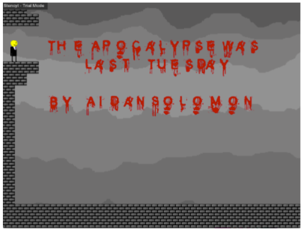
Finally, I wanted to add some finishing touches to the level: the title and my name. It took a while of looking through fonts, but I finally found one that fit my needs, it's called "blood." After that, I was able to add it by creating a whole new layer and tying the words to a spike I hid under some bricks. Lastly, I added a level exit which teleports you to the next level. My first level was finally done!
Week 4 and 5: Isn't vacation great?
Yep, it definitely is!
Week 6: JUST WORK ARGH AKA Music
I spent a while trying to figure out the right kind of music I needed for my game. On the most basic level, it needed to be royalty-free since I don't want to be caught up in any legal shenanigans. I wanted to have the music match the feel of the game, with a nice mix of action and suspense with an undercurrent of horror. I realized the best instrument for this would be piano since the instrument is already associated with horror and all I needed was some quick paced piano music. Strangely enough searching "action/suspense/horror piano royalty free music" didn't exactly yield the best results from Google, but I eventually found what I needed on a site called creepy piano where I found the perfect piece: something's wrong by Myuu. It had a fast pace at times, but still felt creepy! The only problem left was figuring out how to get it in my game.
Placing music in my game turned out to be more frustrating than I had previously thought. After downloading the mp3 version of the music Stencyl wouldn't allow it since it had metadata. "what’s metadata and how do I get rid of it?" After downloading some software from iTunes that promised to remove all metadata and placing the song in everything seemed fine. Nope. The song now has a variable bitrate so now I've got to find a way to stabilize it. "How?" After downloading this new software called Audacity, I was able to remove the metadata and keep the bitrate stable. Not allowed! Now I've got to change the frequency because Flash doesn't like the one I have. "Well, who needs flash!" I yelled at my computer. I changed the game type to mac version, but mac doesn't like mp3 and wants OGG. I remembered seeing that in the export functions of Audacity and a quick change later the music worked! After that I have learned a valuable lesson, I hate music.
Week 7: Welcome to the apocalypse: the cutscene
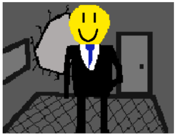
I felt like my game was missing something by not having an opening. Most people who played the game kept asking what was going on, so I decided to give them some information through a short opening scene explaining why the smiley man is the way he is. It starts out showing some skyscrapers and slowly zooms in to show a person is standing by the window. It then shows this is a man in a torn suit who's blank emotionless face is matched by the grey color of his skin. Something blows up in the distance and a strange green circle can be seen in a nearby building. This new discovery brings excitement and hope of life to the depressed grey man and slowly his face lights up yellow and a big smile goes across his face. This transitions well into showing him standing near a broken window and the player can now leap from it onto a nearby building roof. I think this cutscene adds a lot to the character and story of the game not only explaining the motivation of the smiling man, but making the player, and the designer question what the story of this strange new world is.
The rest of the weeks: makin' them levels
Since I had everything I needed to make the levels it was time to put on my level design hat. Now it was my intention to make these levels hard, while still being fair. I wanted to make sure each part of the level was possible to be beaten by someone playing for the first time, not exactly probable for the harder levels, but still possible. Let's go over each level and I'll explain my thoughts in creating it.
Level 1
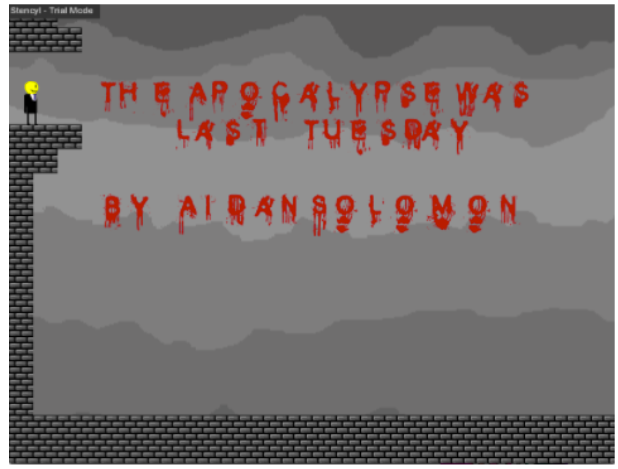
I wanted the first level to be simple so that the players can get to grips with the controls. A large group of players has been people who have never played video games before so I wanted to give them a chance to learn how to play. This stage also functions as a title screen.
Level 2
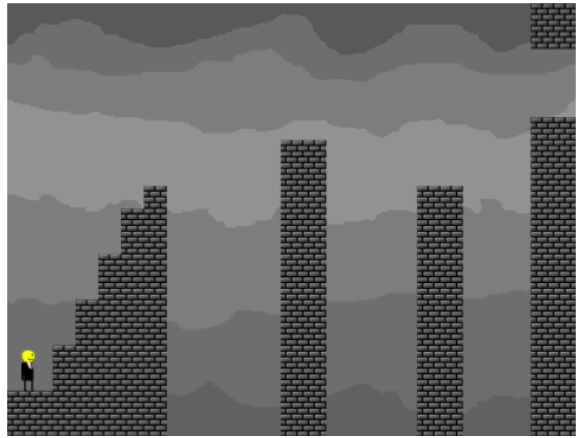
This level exists to teach jumping if the player hadn't realized how to in the previous level. First, you must jump up a set of stairs which only exist to teach how to jump. Then the player must jump a gap that can only be crossed by holding right, teaching the maximum size of the jump and the right times to use that jump. After that is a smaller ledge which can only be landed by letting go of right before reaching the maximum jump distance. If the player tries to do their maximum jump again they will fall into the pit.
Level 3
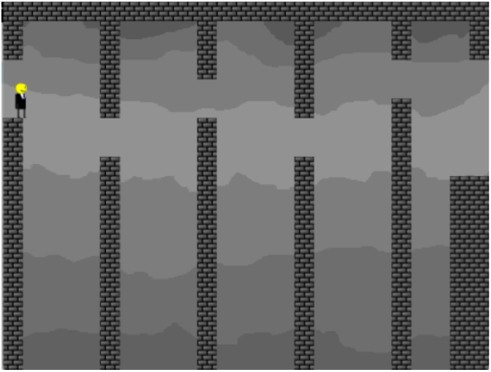
This level shows how to do precise jumps while leaving room for error. An easy level showing how to jump up or land at the right place on the wall. Also, a bit of world-building as you climb through an abandoned building with the floors missing and holes through the walls as if something burrowed through them, like a secret boss or something?
Level 4!
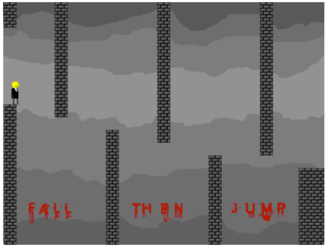
The infamous level 4 was created for a very simple reason. I found a glitch early in development which made the character able to jump after walking off a ledge and decided instead of removing it, basing the whole game around it. I needed to teach players to use it, so what better way than to put a brick wall in their path and not let them continue until the surmounted it. It's probably the hardest level for first timers since the mechanic can be quite hard to grasp.
Level 5
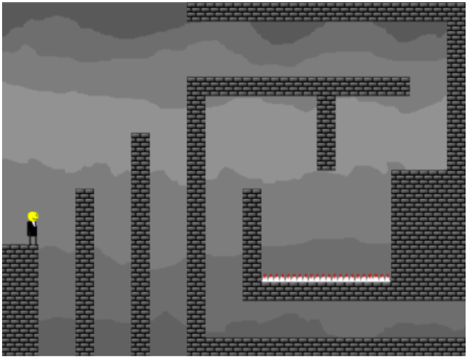
Level 5 is the first test of your skills so far. First testing precision jumping and then a simple double jump. This level also shows the bloody spikes that will be featured heavily in the climax.
Level 6
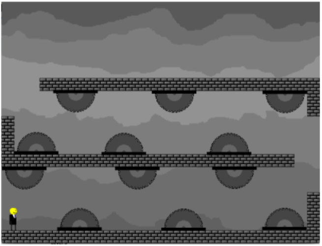
Another mechanic introduction, this level introduces the half saws which you have to weave through to escape. These whirring saws of death are part of another bump in the difficulty while being challenging, but easy enough to get past in a few tries.
Level 7
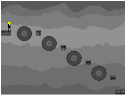
I wanted this level to be a nice easier area so that the audience can cool down and relax at the half saw level. This level, of course, introduces the full saws which seem easy to dodge, for now. This level also gives the players a bit of overconfidence in their abilities or a lack of confidence in mine, until they hit the following level.
Level 8
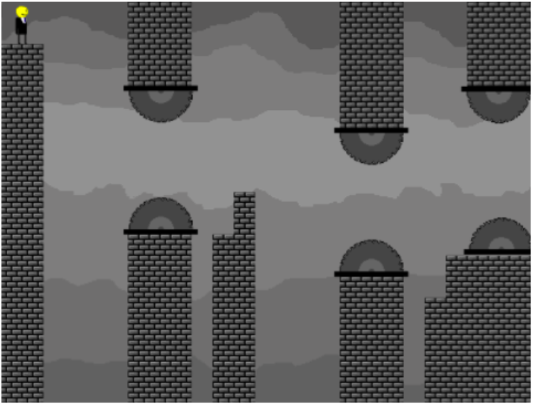
This level combines the lessons learned from the double jumping levels and makes it so there is a lot less margin for error with the addition of saws forcing the player to wait until the very last second to jump. The second hugely difficult level, most were able to get past this, not without quite a bit of frustration of course. The very end of the level can be a little bit tricky since it's not completely obvious the black bar will kill you, but so far most players haven't been too annoyed about that.
Level 9
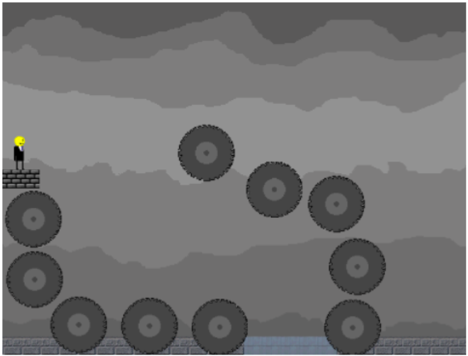
A short easy level, which I made as a transition into the skyscraper shown in the building. The entrance has a completely different style than the rest of the game so far to inspire curiosity at what could be hiding inside.
Level 10
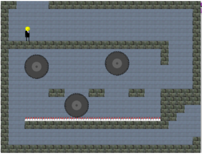
The first level inside the building is shown to have a more blue and calming tone to the rest of the game so far. An introduction to a new idea I came up with to spice up the levels, moving obstacles which force the player to find the perfect time to jump across. After a small break from making levels, this was the perfect thing to do to bring new life into the game: a new setting, new hazards, coming closer to the end of the game.
Level 11
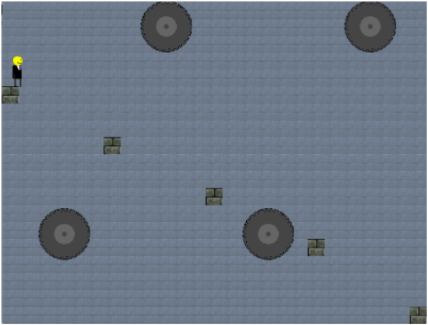
An expansion of the previous challenge, this level increases the size of the jumping area, but also the speed of the saws to create more of a panicked area. The final jump is incredibly tricky since it's actually impossible to jump over the saw, forcing players to remember what was being taught the whole game, to jump under the saw and fly, with the supreme power of the double jump.
Level 12

For the penultimate level, I wanted to be a big test of everything they have done so far. Since there was a lot to cover I decided to make it 3 times as long as any other level. First a few simple jump tests as a bit of a warm-up. Second, a test of your double jumping skills and some weaving around the half-saws. Third, I tested each part of the double jump, I could from introducing new hazards, to forcing them to jump at the last possible second before they fall of the level, to the final leap of faith which I made to seem slightly scarier than it actually is. At the very end is a hallway where the background changes color to show they are entering a new area, The End!
Boss fight!
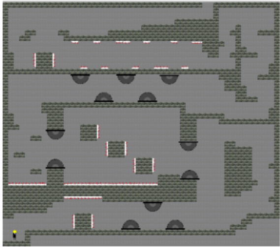
Now I'll throw my hands up here this may have been a bit too hard, but I felt it was a perfect final exam for everything the player is learned, forcing them to not only show they can beat every type of challenge in the game but also to do it fast while dealing with the anxiety of not making it. After a lot of hard work, I finally figured out how to add a sort of time limit, by having a quickly growing tsunami of acid fill the building you are in, forcing you to move fast or die. This time limit makes players panic and tries to go fast usually ending in them losing due to recklessness. I timed the acid to almost kill you at the beginning if you move at a quick pace. The acid consistently rises, while the player notices it a few times at the bottom of the screen urging them forward, until the final gauntlet. At the end of this massive arena (over 4 times as big as my other levels), the player has to climb up and around (top right) an obstruction from the rest of the rest of the level. This gives the acid time to increase making it so that by the time the player is facing the final group of spikes to dodge they will notice and be terrified of the slowly increasing acid. This is the hardest section for most of my playtesters because every time their nerves get to them and they start to rush. I have made some tweaks to make the area easier, but players the acid can cause too much anxiety for them. After that, they have a quick jog to the exit and then they win! The end is simply a cutscene of the man jumping off the building right before the acid would have killed him, and a black screen congratulating them for surviving. A great finale to my greatest accomplishment(so far)!
one year later:
You may be wondering why there is nothing in here on the secret boss or his area. That is because I created those levels after I "finished " the project because I felt like my game was incomplete (and also because one of my friends kept taunting me about my game being too easy). Now, some people have been accusing me of ripping off Slenderman for my boss design and that is just simply not true. It's actually a rip off of Cabadath (AKA The Tall Man) from the game Trilby's Notes who interestingly enough was a rip off of The Zealot from the game Blood II: the chosen. And I will also admit that the design and function of the locked blocks that disappear in the third part of the boss were quite shamelessly stolen from super meat boy.
Interestingly, the reason I gave the boss the ability to teleport which players may have gotten angry at, is actually to help them. Originally, when he couldn't teleport the player would end up in situations where it was actually impossible not to get grabbed by him or be able to run so far away from him that he was no longer a threat. I constantly played through the level and whenever one of these situations occurred, I would add a teleport as to keep the tension high while not making it impossible. The second part of the boss fight was a puzzle idea I had had from the beginning, but had decided it was too hard to put in, that was until I was designing the boss fight. The third part was probably the worst. it not only contains 2 weird glitches I wasn't able to fix (see if you can spot them), but the timing of the block disappearances was based off of how fast it would take me to beat the level, and not the average person leading to the timing being a bit too unreasonable.
Fun Fact: the secret ending was animated from start to finish the day before I had to present it. During the presentation I actually dressed up as the Smiley Man with a full suit and tie, my trilby on my head, and a smiley face taped to my face.
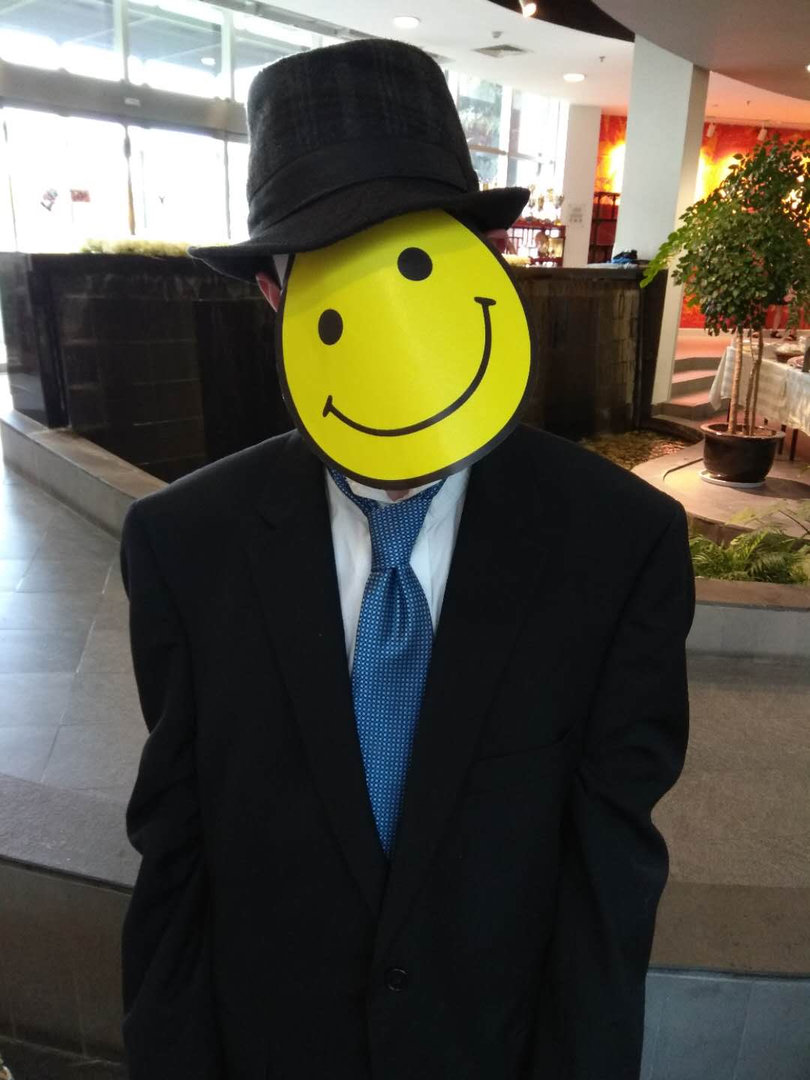
I created "fedora mode" a few weeks before the presentation all in one day, because as I was showering (the ground zero of all my ideas) the concept popped into my mind, and since no one else was home that day, I had no one to stop me from working on that for around 6-7 hours whereupon I had to stop to finally eat. It wasn't until many months had passed that I had my world view shattered when I realized the hat that I always wore and placed in the game was in fact a trilby and not a fedora. When I went back to Stencyl to fix that error I realized my subscription had run out and I didn't feel right about spending $100 just to change that one word. Think of it as a silly mistake I made and laugh, then realize that Stencyl is $100 for a year subscription and compare that to Gamemaker and Unity and say that's pretty overpriced.
As I look back on this game, though I can't help sometimes getting a bit bogged down in the many problems with the game, I'm still quite proud that it was a good as it was.
Get The Apocalypse Was Last Tuesday
The Apocalypse Was Last Tuesday
A short challenging platformer with an innovative game mechanic
| Status | Released |
| Publisher | |
| Author | TheSmileyFace |
| Genre | Platformer |
More posts
- Version 2.0May 23, 2018
Leave a comment
Log in with itch.io to leave a comment.